Baseline & Accessibility in 2026
I’ve had my head in the sand for the last two years while being deep in projects with accessibility remediation and design system work. Recently I wondered: Which new web standard features for accessibility are kind of old news by now and might still be flying under the radar? As it usually goes, my curiosity led me into a little research rabbit hole.
Most major browsers are evergreen, meaning they self-update, bringing along new features once they drop. Of course, in more restricted environments or on Apple systems, those updates may take longer, but there is a certain “good enough support” threshold that the industry of web workers and browser vendors adopted with the Web Platform Baseline project. Everything that has been available for 30 months, even in the latest browser that added support, is considered “Baseline Widely Available”. And if you are using progressive enhancement anyway (which you should) or polyfilling, you can benefit from these features even earlier.
I want to say at this point that I find it more and more problematic these days to just accept “major browsers” as the definitive guidance. Excluding internet users in huge parts of the world this way is a neo-colonial practice. caniuse.com numbers give an indication of which browsers we are missing to support, since some of the browsers are mentioned there. But those numbers are still skewed in a western user base direction. If you’re interested in these kinds of topics, make sure to follow my RSS feed.
Another crucial aspect: the Web Platform Baseline does not include accessibility support, as Adrian wrote extensively about. This is slowly starting to be acknowledged, and Lola and others started doing the work to close that gap and include accessibility compatibility.
Approach
I went on webstatus.dev and retrieved all the features that are baseline widely available as of the day of publishing this article. Since I want to focus on more recent features, I narrowed it down by choosing a cutoff point that lies a bit behind the “baseline widely available” threshold. So in effect, I consider all the features that have been actively supported by the major browsers for two and a half years (30 months) plus 1.5 additional years towards the past: anything that gained wide support in major browsers within the last four years.
I then went through that list and analyzed these different features by their relevance to accessibility. This gave me a dozen or so features that looked interesting. Some of them have been old news in the a11y field for a while. But there are also some interesting ones that, to be honest, flew under my radar, too.
It goes without saying, this list does not cover all the upcoming web standard features or those that are already partly supported by browsers, which will improve accessibility even more in the future.
The :focus-visible Pseudo-Selector
Widely available since March 2022
I said there are some old news features before. This is one of those. The concept of the :focus-visible pseudo-selector has been floating around for longer than the web baseline project. Since the feature was not standardized in the beginning, for a while folks were using the polyfill and added some progressive enhancement, and it actually took until 2022 for this to land in Safari.
If this is the first time you hear about this, :focus-visible allows you to style the focus outline of currently keyboard-focused elements. And it does it so that it actually only shows the outline when the keyboard is being used to navigate. The fact that the outline tied to the older selector (:focus) also showed up in instances where the mouse was used led to the anti-pattern that people would disable the focus outline completely for aesthetic reasons.
/*   Repeat after me:   I. Will. Never. Do. Just. This. Line. In. Production. Code.*/
:focus {  outline: none;}
Instead, we can safely do the following now to take full control over the style of the focus outline. No polyfills, no pain:
:focus {  outline: none;}
:focus-visible {  outline: 2px solid blue;  outline-offset: 2px;}
The prefers-contrast Media Query
Widely available since May 2022
Websites or apps must have sufficient contrast for text and UI by default (at least the WCAG AA thresholds for text contrast and UI contrast). But the reality is quite different, and often organizational rules or people can be an obstacle to achieving that.
Enter the prefers-contrast media query, which by now landed 4 years ago. This media query has two practical use cases.
In the past I helped out a few art institutions, and quite often I observed the “conflict” between creative and artistic freedom and universal accessibility. I don’t think this is a systemic conflict but a human-made one.
Another conflict scenario would be corporate design policies (or reluctant managers) that prevent changes to the design system or color palettes.
prefers-contrast allows for an escape hatch in these situations.
If your hands are bound with the general design, add another design that is high contrast and exceeds the WCAG thresholds generously (that way you also pass WCAG 1.4.3, since at least one design exists to satisfy the threshold). Allow users to opt in to it if they do prefer higher contrast. The media query checks the user’s system settings and adapts the CSS accordingly. This is particularly easy to implement if you are making good use of CSS variables in your designs:
:root {  --text-color: #777;  --bg-color: #eee;  --border-width: 0px;}
@media (prefers-contrast: more) {  /* Just replace the variables with higher contrasting values */  :root {    --text-color: #000;    --bg-color: #fff;    --border-width: 2px;  }}
.card {  color: var(--text-color);  background-color: var(--bg-color);  border: var(--border-width) solid currentColor;  padding: 3rem;  max-inline-size: 5rem;  border-radius: 16px;}
The second use case for this feature is to take your design that is already satisfying WCAG AA color contrasts and a11y it up to the level of WCAG AAA color contrasts, which dictate higher thresholds (7:1 instead of 4.5:1 for text, etc.).
This way users always have more options. And more “options are good for the people”.
The forced-colors Media Query
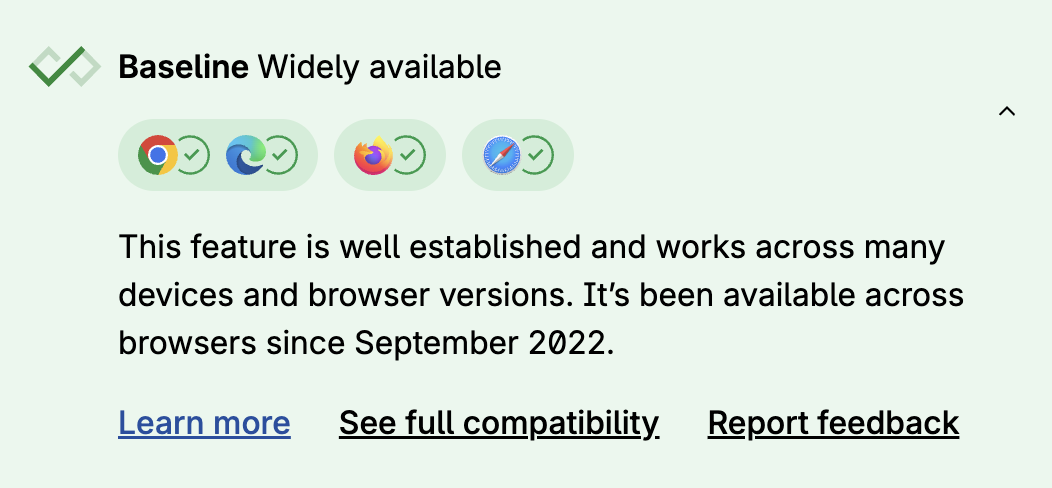
Widely available since September 2022
While being very similar to the previous one, this media query is specifically for styling of the Windows High Contrast Mode (WHCM; Windows 11 nowadays calls it Windows Contrast Themes). Microsoft claims that 4% of Windows machines use it. If you think that is niche, think again about the market share of Windows.
This is a topic that deserves its own education, and there are awesome conference talks and other good resources about it, which go deep into the details.
To summarize what it does: once a user toggles that mode on in their Windows settings, your CSS rules about background colors, shadows, and many other values are thrown out the window and replaced with a fixed set of high-contrast system colors. If your design relies on those values for visibility and readability, it will break.
By querying for this mode you can make CSS adjustments specifically for WHCM.
The <search> Element
Widely available since October 2023
The first rule of ARIA is to not use it when there is an equivalent native HTML feature you can use instead.
Before you had to mark a search landmark with role="search" now you can wrap a search form in a native <search> tag. This automatically creates a search landmark.
<search> <label for="search-field">Enter your query</label> <input type="search" id="search-field" /> <button type="button" id="search-button">Search</button></search>The inert Attribute
Widely available since April 2023
In my experience the thing that gets ignored the most by people who are not relying on assistive technologies daily are issues around invisible and disabled/inactive content.
If you asked me for a gut feeling of how many websites have a completely broken and inaccessible navigation menu, I’d say over 90%. Most of the time, visually hidden menu content is still focusable via keyboard or screen reader, or foreground content like modal dialogs or fullscreen menus don’t deactivate the user interface that is in the background.
We want equivalent user experiences for all users. If something is inactive, it should not be possible to interact with it by anyone. The same as when something is visually hidden, it should be hidden from everyone.
The inert attribute is a very helpful global HTML attribute that does the heavy lifting for you. It can make a whole section of the DOM…well, inert. The element it is set on and all of its children cannot be interacted with. Not by mouse. Not by keyboard. Not by screen reader. As with any powerful tool, you are responsible for handling it properly. inert sections don’t show their inertness visually. It is up to devs to also let users know visually that an area is inert. For the examples I mentioned in the beginning, for example, a modal dialog darkening the backdrop, that is already often the case.
ARIA Attribute Reflection
Widely available since October 2023
You know how you can access DOM attributes via JS? Given this HTML, for example:
<input placeholder="DD/MM/YYYY" />You can easily access and modify this via JS:
input.placeholder = "DD.MM.YYYY";This did not work for ARIA attributes before. You had to go through the setAttribute/getAttribute methods.
element.setAttribute("aria-label", "Close");element.getAttribute("aria-label");Now you can do this:
element.ariaLabel = "Close";console.log(element.ariaLabel);This seems like a small convenience feature, but it’s actually a big stepping stone towards better web components compatibility, which the next feature is also about.
Form-Associated Custom Elements (Web Components)
Widely available since March 2023
If you’re a fan of web standards, you might have already dived a lot into web components. Their adoption has been hindered by a lot of factors over the years. Next to our usual techno-feudalists telling distorted realities about the DOM being trash and that Meta React solves all of our problems with “speed”, “developer experience” and so on, another big problem has been a lack of features and some compatibility issues. For example, writing custom elements for form components came with its limitations.
Let’s say you wanted to develop your own in-house component library based on web components. Your custom checkbox component within an HTML form would not be detected by the browser as part of that form, and the checkbox would not land automatically in the FormData etc.
Now you can specifically opt in to a custom element and signal to the browser that it is a form associated element.
class MyCheckbox extends HTMLElement {  static formAssociated = true;  static observedAttributes = ["checked"];
  constructor() {    super();    this._internals = this.attachInternals();    this.addEventListener("click", this._onClick.bind(this));  }
  // Shortenend for brevity.}customElements.define("my-checkbox", MyCheckbox);
One more step into the direction of web component adoption.
Could 2026 be the year of web components?
The <dialog> element & :modal
Widely available since March 2022 (<dialog>) & September 2022 (:modal)
While the dialog element in HTML has existed for a while now, it used to be the recommendation not to rely on it because its support and features were suboptimal, to say the least. Kitty’s a11y-dialog was my go-to recommendation during that period. This started changing around 2023, and as of now, <dialog> is considered to be good to use with some remaining caveats. As always, be aware of those and test your application with different assistive technologies, including different screen readers.
The dialog element can be used like this (JS needed):
<button id="open-button">Open Dialog</button><dialog id="dialog">  <p>Decolonize!</p>  <button id="close-button">Close</button></dialog>
<script>  const openButton = document.getElementById("open-button");  const closeButton = document.getElementById("close-button");  const dialog = document.getElementById("dialog");
  openButton.addEventListener("click", () => dialog.showModal());  closeButton.addEventListener("click", () => dialog.close());</script>
Side fact: There is also a JS-less version which landed in baseline last year and works with just(!) declarative HTML.
The :modal pseudo-selector then allows you to style the native dialog:
:modal { background-color: pink; border: 1px solid indigo; border-radius: 8px;}Solid Foundations to Build On
If you paid attention to the sublines under each section heading, you are able to tell that a lot of these features have actually been available for a long time now.
In my experience working with different polyfills and component frameworks, there’s always a little something that is lacking. If you are very unlucky, the component framework you have been using gets abandoned, or open accessibility issues stay unfixed.
Using browser native features does not mean that the browsers won’t have accessibility bugs. But due to the nature of browser updates, you should get these fixes continuously. Also, browser vendors are guided by the UAAG, the User Agent Accessibility Guidelines. In an ideal world, it would not just be guidance but also legal obligation, for example, through the European Accessibility Act. The directive states that operating systems are legally obliged to be accessible. Whether browsers are falling under that is probably a legal argument one would have to dissect. If you consider mobile platforms like iOS, you could argue that the browser (engine) is tied to the operating system and thus a part of it. But on the other hand, Mozilla doesn’t do an operating system (anymore), just a browser. I’ll leave that particular question to the lawyers.
As developers and accessibility workers in general, we should always do our best to stay informed on the technical side of things at least.